Conquering Your Kitchen Remodel: A Step-by-Step Guide
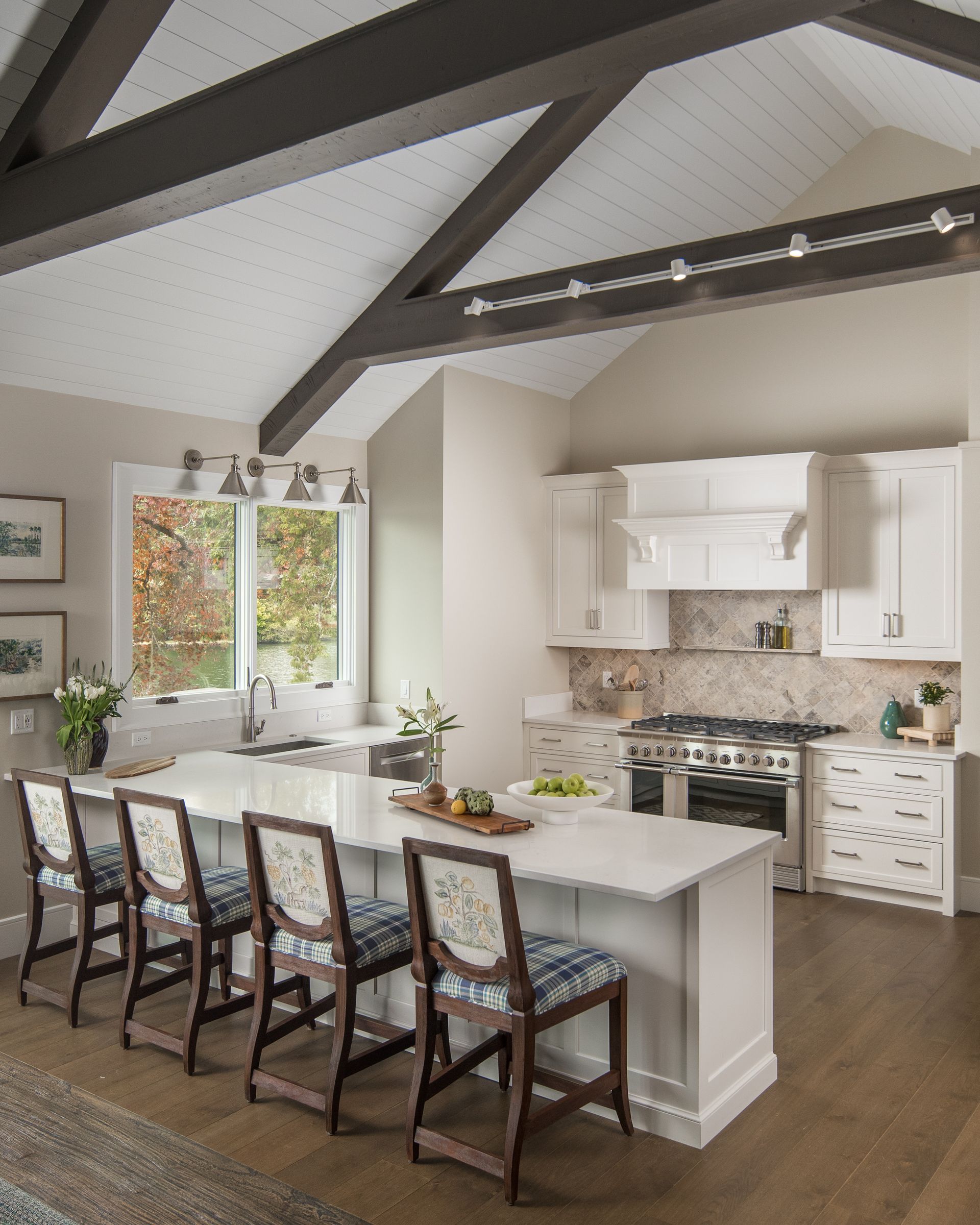
So, you've decided to embark on the exciting (and sometimes daunting) journey of remodeling your kitchen! Whether you crave a modern makeover, a functional upgrade, or simply a space that reflects your personal style, a well-planned kitchen remodel can transform your home and your life. But where do you even begin? Don't worry, we've got you covered! This step-by-step guide will equip you with the knowledge and confidence to navigate your kitchen remodel like a pro, and KOTS is here to help every step of the way!
Step 1: Dream, Design, and Define:
- Vision Board: Start by collecting images and ideas that represent your dream kitchen. What are your must-have features? Browse magazines, Pinterest boards, and home design websites to gather inspiration.
- Functionality: Analyze your current kitchen layout and workflow. What works? What doesn't? Identify areas for improvement based on your cooking habits and needs.
- Budgeting: Be realistic! Set a budget and stick to it as much as possible. Unexpected costs can arise, so plan for a 10-20% buffer. Consider financing options if needed.
Step 2: Assemble Your Team with KOTS Expertise:
- Contractor: Finding a reputable and experienced contractor is crucial. KOTS can connect you with a network of trusted contractors, ensuring you find the perfect fit for your project and budget.
- Designer: An experienced designer can help translate your vision into a workable plan, especially for complex layouts or intricate details. KOTS offers in-house design consultations to help you explore your options and create a stunning design.
- Architect: If your remodel involves structural changes or significant plumbing and electrical modifications, an architect may be necessary. We can guide you in determining if an architect is needed for your project.
Step 3: Planning and Permits with KOTS Guidance:
- Detailed Plans: Work with your KOTS designer or a contractor from our network to create detailed plans, including layouts, elevations, material specifications, and electrical/plumbing requirements.
- Permits: we can assist you in obtaining all necessary permits from your local building department, ensuring your project adheres to safety regulations and building codes.
Step 4: Demolition and Rough-In with KOTS Support:
- Demo Day: Brace yourself for the dust and noise! This is when walls are removed, plumbing and electrical lines are rerouted, and the subfloor is prepped. Our team can help you navigate this phase by providing qualified professionals and ensuring everything is done according to plan.
- Rough-In: Plumbing, electrical, and ventilation systems are installed according to your plans. We work closely with contractors to ensure a smooth and efficient rough-in process.
Step 5: Installation and Finishing Touches with KOTS Expertise:
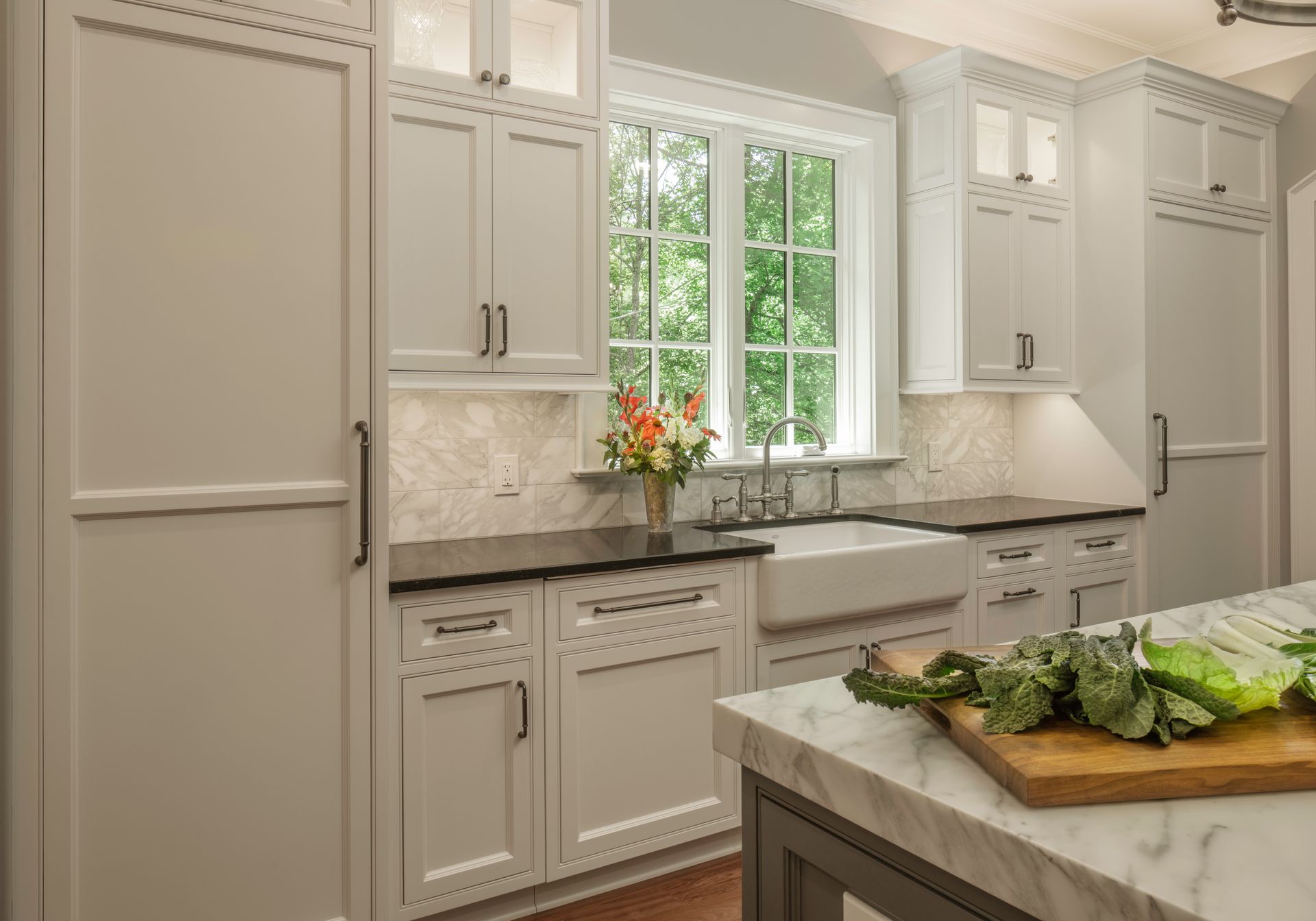
- Cabinets and Countertops: This is where your kitchen starts to take shape! We offers a wide selection of high-quality cabinets and countertops to fit your style and budget. Our experts can guide you in choosing the perfect options for your dream kitchen.
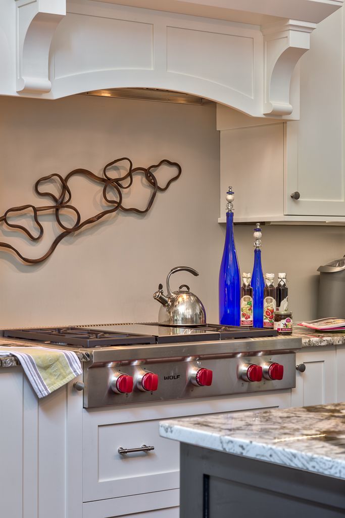
- Appliances: Choose energy-efficient appliances that align with your needs and cooking style. We can provide expert advice on appliance selection and integration.
- Flooring: Select flooring that is durable, water-resistant, and easy to clean. Hardwood, tile, and luxury vinyl plank are popular options. We offer a variety of flooring options to complement your kitchen design.
- Lighting: Layered lighting is key! Include ambient, task, and accent lighting to create a warm and inviting atmosphere. We can help you design a lighting plan that meets your needs and aesthetic preferences.
- Backsplash: Add a decorative touch with a stylish backsplash. Tile, glass, and stone are common choices. We have a variety of backsplash options to complete your kitchen's look.
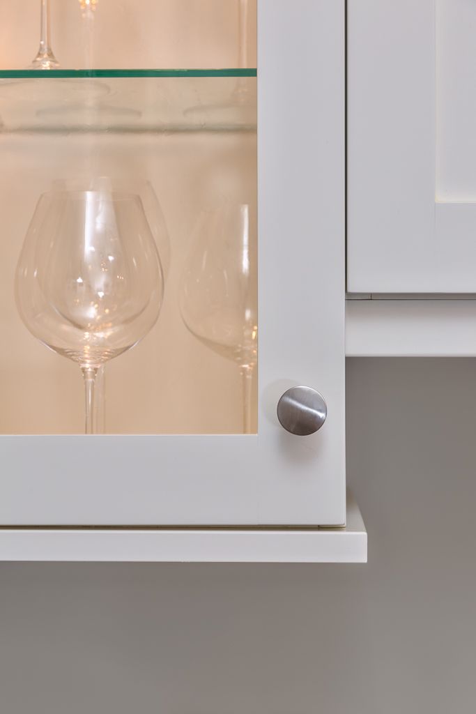
- Finishing Touches: Don't forget the details! Hardware, faucets, cabinet pulls, and accessories personalize your space. KOTS can help you find the perfect finishing touches to bring your dream kitchen to life.
Step 6: Enjoy Your Dream Kitchen with KOTS Satisfaction Guarantee!
After the final touches and inspections, it's time to celebrate! Unveil your stunning new kitchen and enjoy the increased functionality, beauty, and value it brings to your home. At KOTS, we stand behind our work and offer a satisfaction guarantee, ensuring you're completely happy with your dream kitchen.
Call us today!
